

UI
UI Types
Open the UI menu in the editor header to build interfaces for your world. Each type is made for a different place: on top of the screen, above an item, or inside the 3D scene.
| Type | Where it appears | Best for |
|---|---|---|
| Overlay UI | Over the screen when an event shows it | Menus, dialogs, shops, prompts |
| HUD UI | On screen throughout play | Health, score, ammo, on-screen buttons |
| Floating UI | Above an item, following it as it moves | Name tags, enemy health bars |
| Spatial UI | On a UI Panel placed in the 3D world | Terminals, information boards, VR menus |
Overlay UI
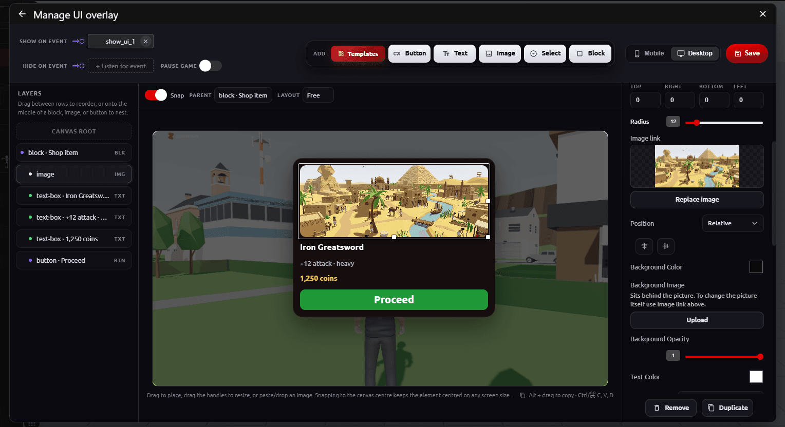
The Overlay UI editor lets you design interactive screens (buttons, text, images, and dropdowns) that appear on top of the 3D world.
Overlay UI is:
- No-code
- Event-driven
- Fully customizable
- Responsive for Mobile and Desktop
What is Overlay UI?
A screen-based UI layer rendered above the 3D world. Commonly used for:
- Start screens
- Instructions and hints
- Interaction buttons
- Dialogs and prompts
- Menus and overlays
Creating an Overlay
- Open UI → Overlay UI.
- Click Create New UI Overlay, or pick an existing overlay from the list. Use Copy on a row to duplicate one.
- Add elements, choose when the overlay shows and hides, then click Save.
Show, Hide, and Pause
- Show on Event - The overlay opens when this event fires
- Hide on Event - The overlay closes when this event fires
- Pause Game - Stops the game clock while the overlay is open. Use it for pause menus, shops, and confirmation dialogs
While an overlay is open, the mouse cursor is freed so players can click it, and player movement is blocked.
Adding Elements
Click an element in the Add bar or drag it onto the canvas. You can also paste or drop an image straight onto the canvas.
- Templates - Ready-made groups such as quest cards, dialogue boxes, shop items, and game over screens
- Button - Fires an event On click, with an optional hover effect
- Text - A fixed message, or a live value from a variable
- Image - Icons, pictures, and backgrounds. An image can also fire an event on click
- Select - A dropdown. The player's choice is stored in a Selection Variable, and it can fire an event On change
- Block - A container for grouping and arranging other elements
Templates
Click Templates to browse Featured, Community, and My templates. Click Add to place a group on the canvas, then edit its text, images, and events like any other elements.
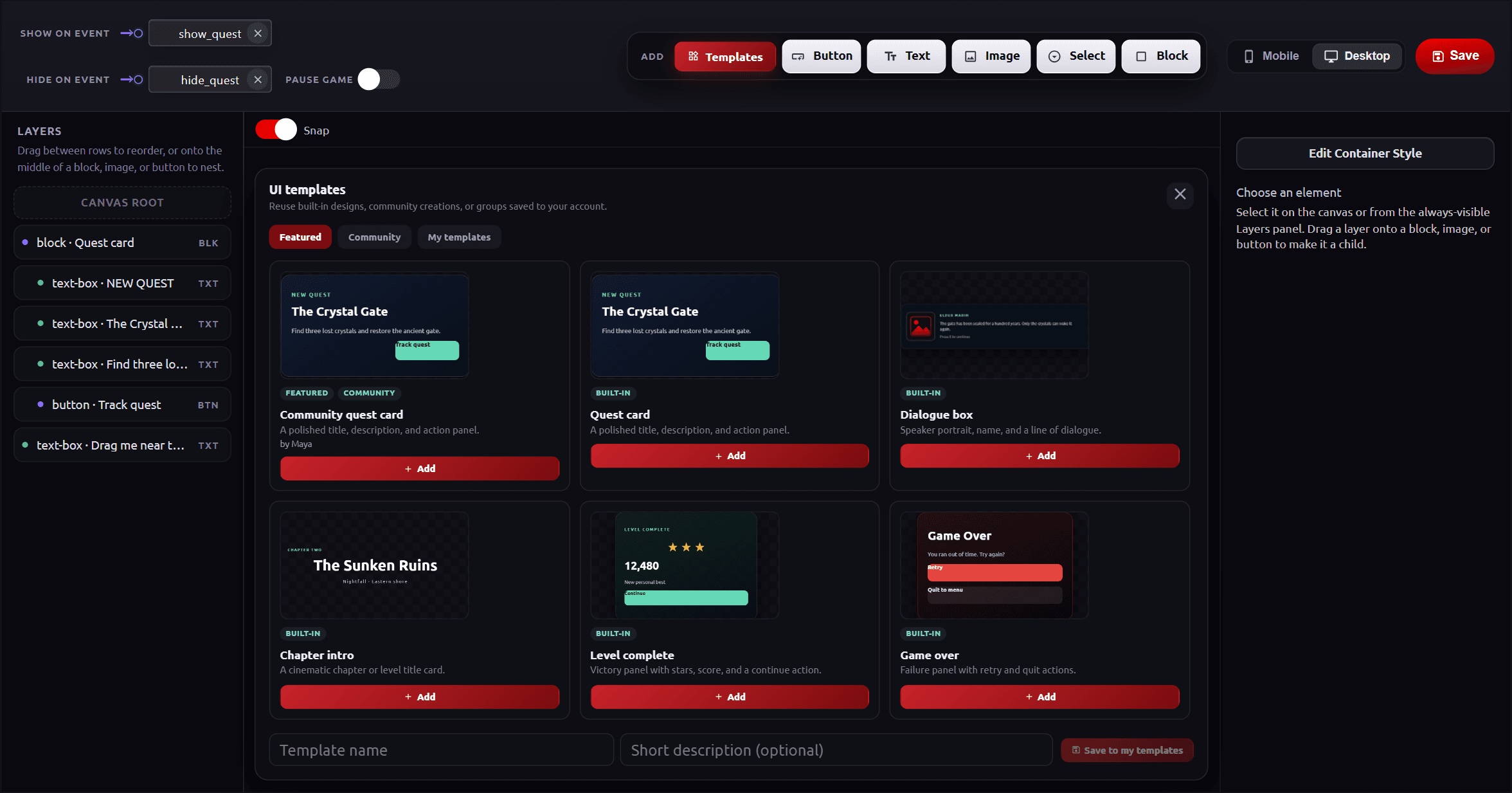
- To reuse your own design, select it (selecting a block saves everything inside it), enter a Template name, and click Save to my templates
- Click Submit for review on one of your templates to share it in Community
- Overlay UI and HUD UI each have their own set of templates
Layers, Nesting, and Layout
- Layers lists every element. Drag between rows to change the order, or drop a row onto the middle of a block, image, or button to nest it inside
- Parent shows, and changes, which element the selected one sits inside
- Layout sets how a container places its children. Free lets you drag them anywhere. Row and Column line them up automatically, with a gap, inset, and alignment
- Snap aligns elements to the canvas center, the edges, and nearby elements. An element snapped to the center stays centered on any screen size
- Hold Alt while dragging to copy an element. Ctrl/Cmd + C, V, and D copy, paste, and duplicate
Styling Elements
Select an element to edit it in the settings panel on the right: size, padding, position, background color, image and opacity, text color and font, and corner radius. Custom CSS Overrides accepts CSS rules for anything the panel does not cover. With nothing selected, Edit Container Stylestyles the overlay's own container.
Mobile and Desktop
Switch between Mobile and Desktop at the top right to preview how the overlay fits each screen before saving.
HUD UI (Heads-Up Display)
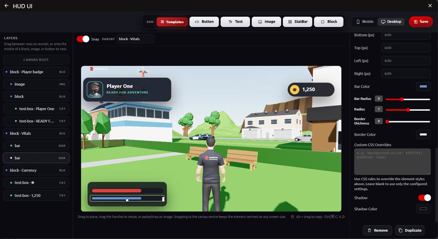
The HUD UI system displays persistent, in-game information that stays visible while playing.
HUD UI is:
- Always visible during gameplay (unless hidden by events)
- Event-driven
- No-code
- Responsive for Mobile and Desktop
Typical Use Cases
- Health bar
- Ammo count
- Score
- Interaction buttons
- Status indicators
Building a HUD
Open UI → HUD UI. The editor works like the Overlay UI editor, with the same layers, snapping, layout, and templates. HUD templates are on-screen readouts such as a player badge, health and stamina, ammo counter, timer, and objective tracker.
- Templates, Button, Text, Image, and Block - The same as in Overlay UI
- StatBar - A bar that fills from a variable, for health, stamina, fuel, or progress
StatBar
- Value source - The variable the bar follows
- Max value - The value at which the bar is full (100 by default)
- Bar Color, Bar Radius, Radius, and Border thickness - How the bar looks
Showing Variables
Next to a Text element's Text field, switch value to variable and pick a variable. The text updates whenever the variable changes, so scores, coins, and timers need no extra logic.
Element Settings
- On click - The event fired when a button or image is clicked or tapped
- Show on / Hide on - Events that show or hide this one element
- Replace control - Makes the element act as a built-in game button, such as Jump, Run, Interact, Fire, Aim, Reload, or a movement direction. The stock button it replaces is hidden while your element is on screen
HUD vs Overlay UI
| HUD UI | Overlay UI |
|---|---|
| Persistent during gameplay | Temporary screens |
| Gameplay information | Menus, dialogs, prompts |
| Updates in real time | Shown/hidden by events |
Floating UI
Floating UI is a small label that sits above an item and follows it as the item and the camera move. Use it for name tags, NPC labels, and enemy health bars.
Designing a Floating UI
- Open UI → Floating UI and click Create Floating UI.
- Enter a Design name, then add Text, Image, or Health bar elements.
- Click Save. Any item in the world can now use the design.
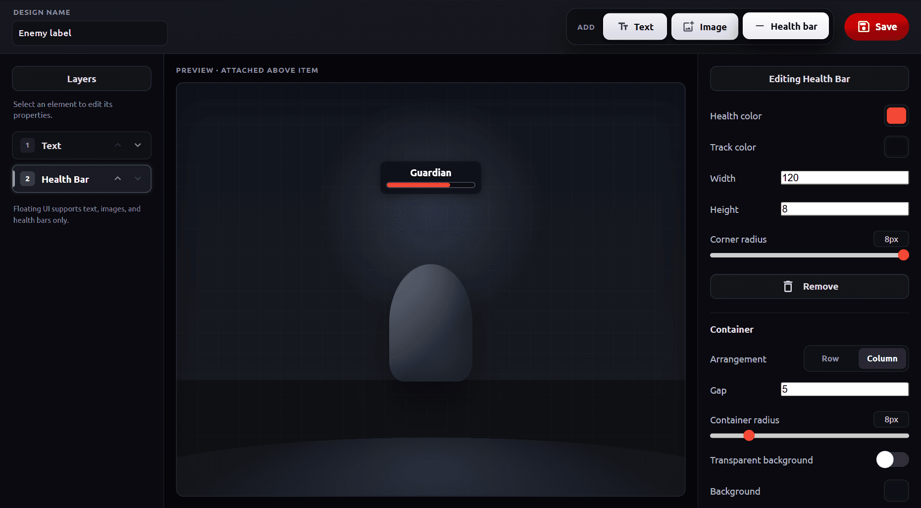
- Text can include tokens that fill in for each item:
{name},{health}, and{maxHealth} - A Health bar fills from the item's current health, with its own health and track colors
- Container settings arrange the elements in a Row or Column and set the gap, corner radius, background, border, and padding
- Use the arrows in Layers to change the order of elements
Adding Floating UI to an Item
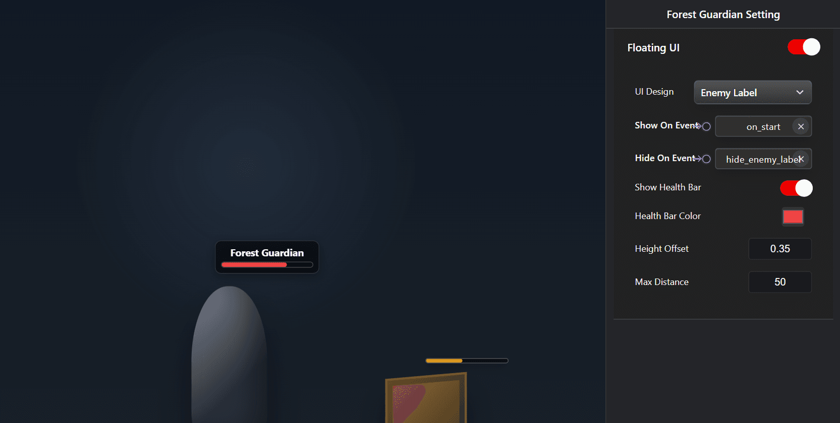
Select the item and turn on the Floating UI section in its settings. For example, to show an enemy's name and health bar above the character, select the enemy, keep Default name label, and turn on Show Health Bar.
- UI Design - Default name label shows the item's name. Every Floating UI you create is listed here too
- Show On Event - The label stays hidden until this event fires. Leave it empty to show the label from the start
- Hide On Event - The event that hides the label
- Show Health Bar and Health Bar Color - Adds a simple bar that follows the item's health from its damage settings
- Height Offset - How far above the top of the item the label sits (0.35 by default)
- Max Distance - The label hides when the camera is farther away than this (50 by default)
Floating UI is drawn on the screen, so it does not appear in VR. For interfaces players use in VR, use Spatial UI.
Spatial UI
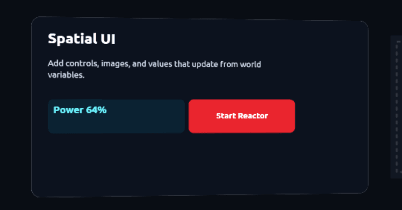
Spatial UI is a design that lives inside the 3D world instead of on top of the screen. You design it once, then show it on a UI Panel from the Basics library. Players walk up to the panel and use its buttons with a mouse, touch, or VR controller. Use it for terminals, control panels, information boards, and menus in VR.
Designing a Spatial UI
- Open UI → Spatial UI and click Create Spatial UI.
- Name the design in the field at the top right.
- Build it with Templates, Button, Text, Image, StatBar, and Block, then click Save.
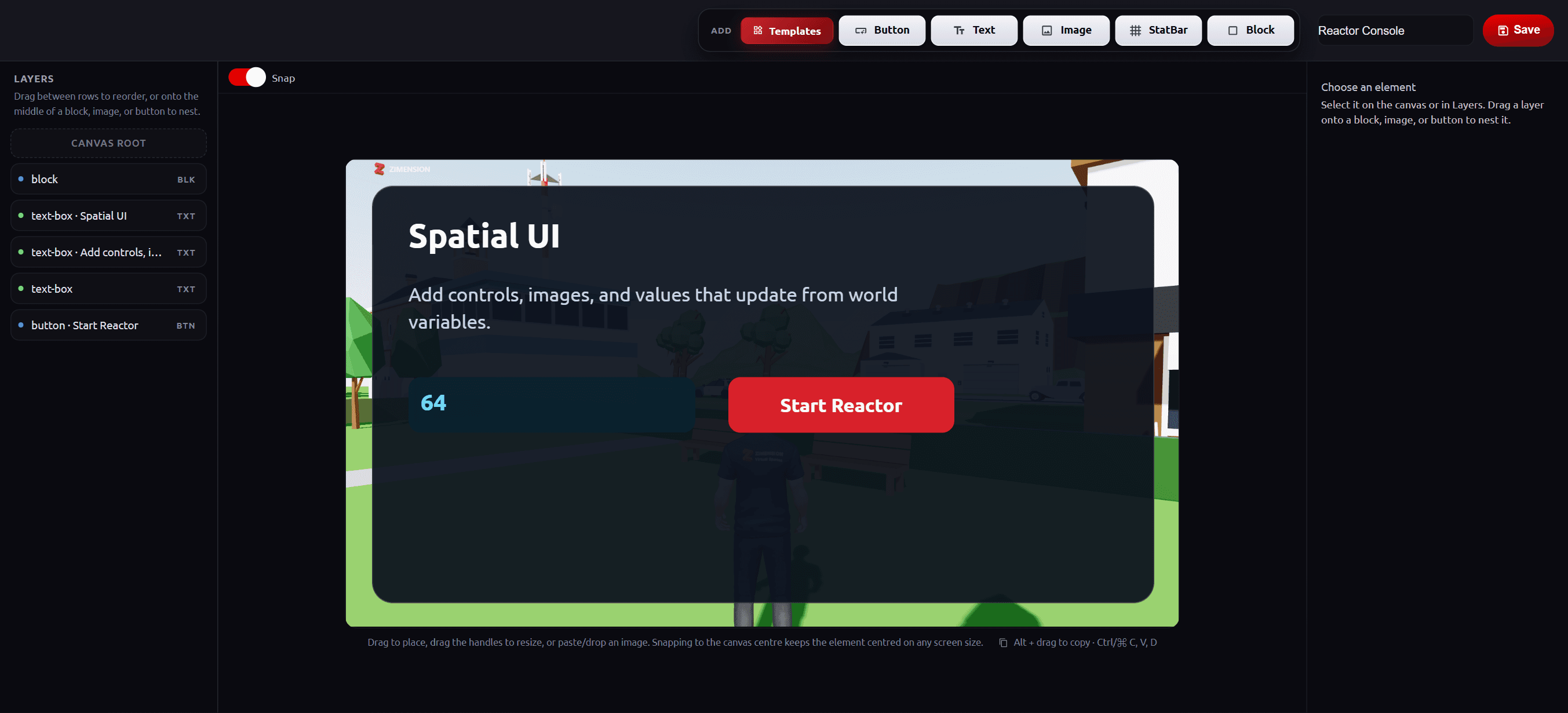
- The editor is the same as the HUD UI editor. There is no Mobile or Desktop switch, because the panel's size in the world does not depend on the player's screen
- Text and StatBars bound to variables keep updating while the game runs
- Buttons fire their On click events, so a panel can drive any logic in your world
Showing Spatial UI on a Basics Panel
To put a clickable menu, screen, or sign into the world, including one VR players can use, place a UI Panel and give it your design:
- Click New Item, open Library, select Basics, go to Panels, and add a UI Panel.
- Select the panel and choose your design in Spatial UI. If you have not made one yet, click Create a Spatial UI.
- Set Panel Width (m). The height follows the shape of the design.
- Move the panel into place and rotate it to face the player.
- Set Enable Pointer to an event, for example one fired when the player walks up to the panel, so they can aim at its buttons.
UI Panel Settings
- Spatial UI - The design shown on the panel
- Panel Width (m) - The panel's width in the world, from 0.1 to 8 meters
- Texture channel - Emissive makes the panel glow like a screen, with Emission Intensity for brightness. Diffuse lets scene lighting shade it like a printed sign. Unlit shows the colors exactly as designed, whatever the lighting
- Transparent and Opacity - Let see-through parts of the design show the world behind the panel
- Double Sided - Makes the design visible from behind the panel too
- Enable Pointer - The event that frees the mouse cursor and turns on the VR hand ray, so the player can aim at the panel
- Disable On Selection - On by default: the pointer goes away as soon as the player clicks something on the panel. Turn it off to keep the pointer until the Disable Pointer event fires
The Panels category also has a Video Panel for screens that play a video. See Basics Library for every panel type.
Best Practices
- Keep overlay UI minimal during gameplay
- Use clear button labels
- Use opacity to keep world visible
- Always connect buttons to logic via events
- Use Floating UI for information that belongs to one item, and Spatial UI for anything players should use in VR
- Test on both mobile and desktop